
OASIAC journal
Why Aker Fassi color can look different in photographs
Lighting, camera processing, screen settings and the amount applied can all change how a cosmetic shade appears. Treat a photograph as an illustration of the format rather than a guarantee that the same color will look identical on every complexion.
Explore Aker Fassi Blush →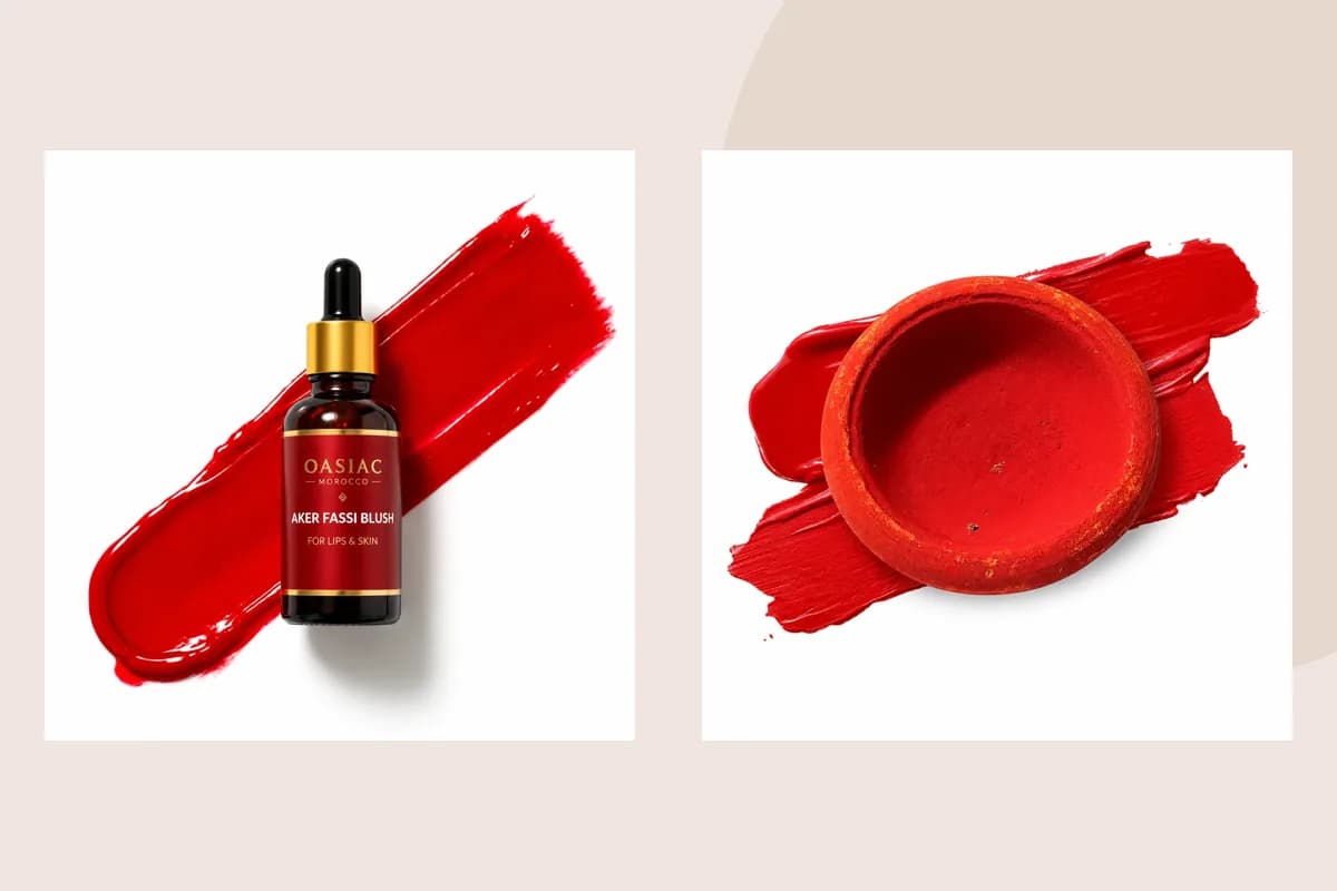
Compare what the image actually shows
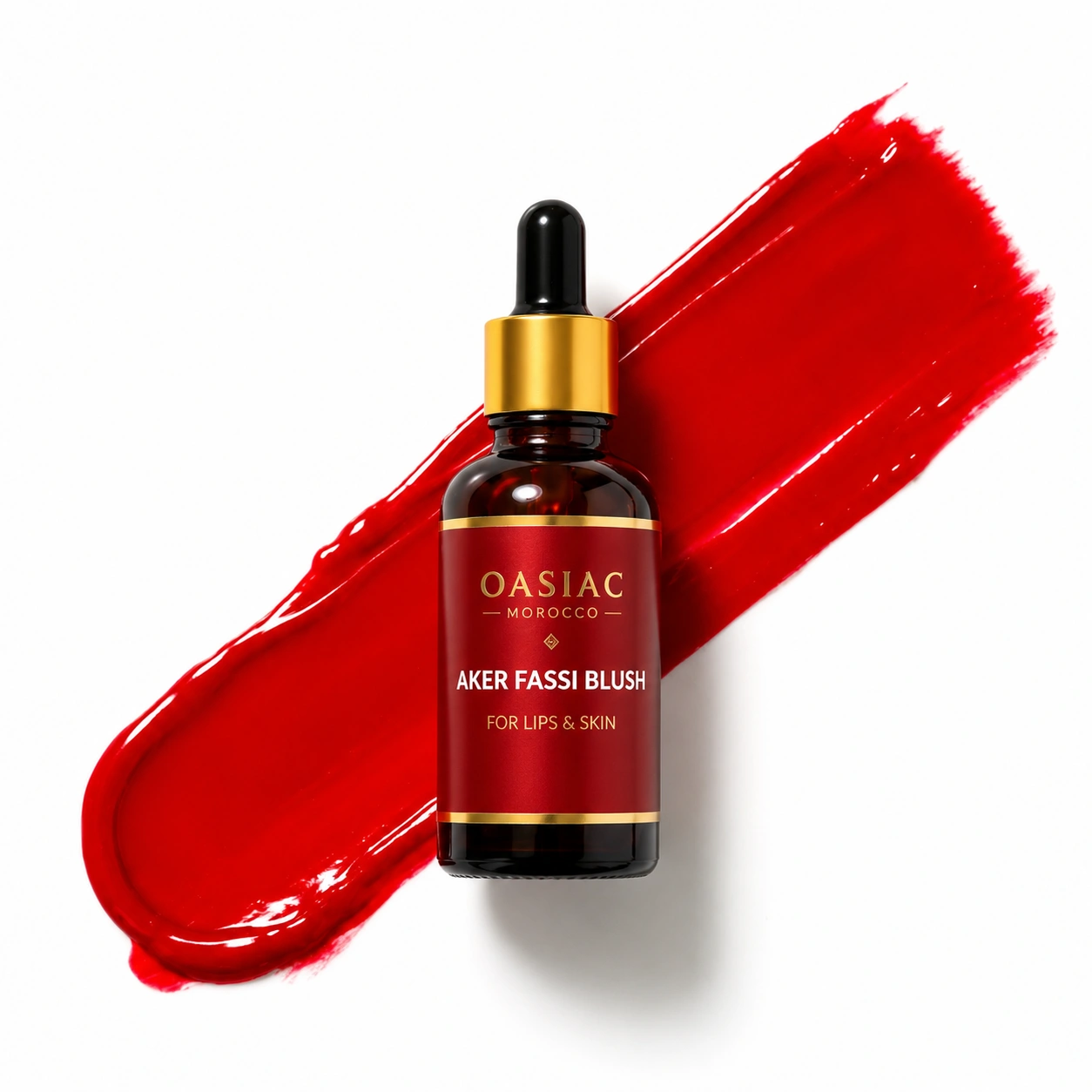
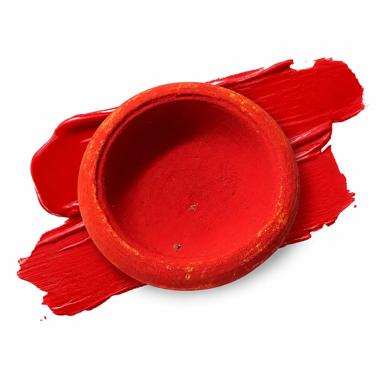
A close-up may show the product concentrated on a tool, while another image shows it blended over skin or makeup. Those are different stages. A thick swatch is useful for seeing color, but it is not necessarily the amount intended for an everyday application.
The base also matters. Bare skin, a foundation layer and a lip product underneath can alter the visible finish. A social media demonstration rarely documents every one of those variables, so reproducing the exact camera result should not be the standard for judging your first application.
Product details and directions
Make a more useful comparison
Look for both packaging images and application information.
Notice whether the product is shown concentrated or blended.
Begin with a small amount under light in which you can see placement clearly.
Build color gradually according to the specific product's directions.
Separate the shade question from the format question
OASIAC's 30 ml blush and 50 g clay pot use different handling methods. The powder is another product again. Choose a format whose application you enjoy, then assess the intensity you prefer rather than expecting a photograph to answer every question.
Explore the OASIAC product galleries with these distinctions in mind. Product identity and instructions should remain clear even when an editorial image is designed to create atmosphere.